Grid Layout
Grid is the main layout tool for inline body content, modal content, fullscreen content, and tab panels.
Use it when the card should contain more than one nested Lovelace card and the visual rhythm matters.
Core fields
| Field | Purpose |
|---|---|
grid.columns |
number of columns or a raw CSS template string |
grid.gap |
shared gap between items |
grid.row_gap |
vertical gap |
grid.column_gap |
horizontal gap |
colspan |
make one nested card span multiple columns |
rowspan |
make one nested card span multiple rows |
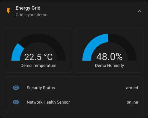
Simple two-column layout
Rendered preview
YAML
type: custom:universal-card
title: Energy Grid
grid:
columns: 2
gap: 12px
body:
cards:
- type: gauge
entity: sensor.demo_temperature
- type: gauge
entity: sensor.demo_humidity
- type: entities
colspan: 2
entities:
- entity: sensor.security_status
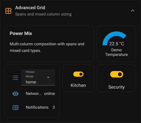
- entity: sensor.network_health_sensorMixed template columns
Use a string for grid.columns when equal-width columns are not enough.
Rendered preview
YAML
type: custom:universal-card
title: Advanced Grid
grid:
  columns: "1.4fr 0.8fr 1fr"
  gap: 10px
  row_gap: 10px
  column_gap: 14px
body:
  cards:
    - type: markdown
      colspan: 2
      content: Summary
    - type: gauge
      entity: sensor.demo_temperature
    - type: entities
      rowspan: 2
      entities:
        - entity: sensor.network_health_sensor
Where grid is used
Grid rules apply in these areas:
- regular
expandbody content modalbody contentfullscreenbody content- each tab panel in
tabs
That means one grid model can be reused across several body modes.
Practical guidance
Use these rules if you want predictable results:
- start with numeric
columnsbefore switching to a raw CSS string - use
colspanfor hero cards and summaries - use
rowspanonly when the height difference is intentional - keep modal and mobile layouts simpler than desktop dashboards
- prefer a
vertical-stackinside one grid cell over very aggressive grid templates
Mobile guidance
Multi-column layouts are useful, but mobile screens expose bad spacing quickly.
Prefer:
columns: 1orcolumns: 2- moderate
gapvalues such as8pxto14px - fewer wide spans
Be careful with:
- very custom template strings
- many nested cards with different intrinsic heights
- dashboard designs that depend on exact pixel-perfect row balance