Universal Card System
Universal Card for Home Assistant
Advanced Lovelace card with 7 body modes, CSS Grid layout, 21 themes, and a visual editor.
Release Latest
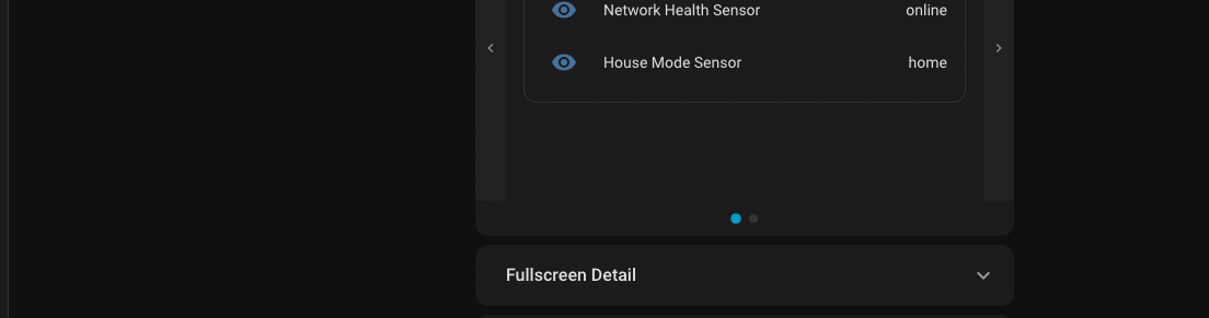
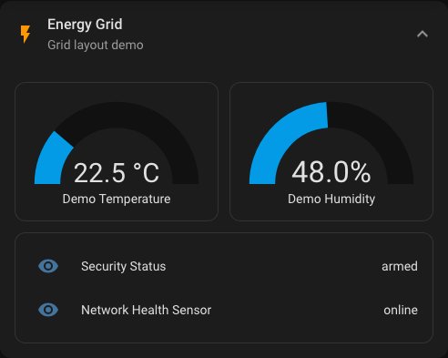
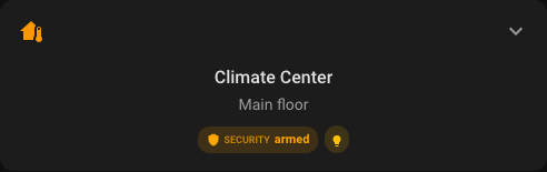
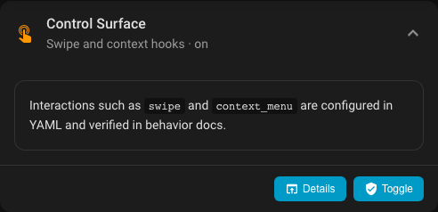
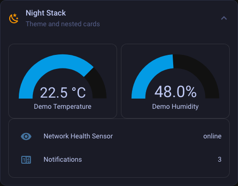
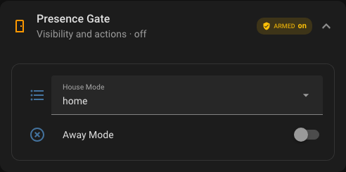
Modes 7 body modes
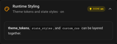
Themes 21 presets
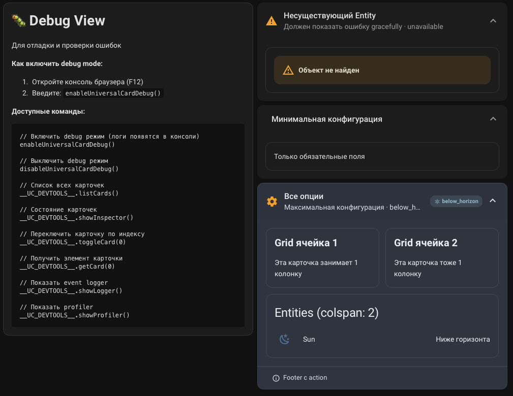
Install HACS ready