Footer
The footer is the supporting action and status area at the bottom of the card.
Use it when the header should stay focused and the card still needs:
- helper text
- secondary actions
- slot cards
- low-priority controls
Footer structure
The footer has three zones:
- left slot
- main content
- right slot and actions
Main config blocks:
footerfooter_leftfooter_right
Main footer fields
| Field | Purpose |
|---|---|
footer.text |
helper or status text |
footer.icon |
optional icon next to footer text |
footer.cards |
nested cards in the footer content area |
footer.actions[] |
footer action buttons |
footer.tap_action |
action when clicking the footer |
footer.hold_action |
hold action for the footer |
footer.sticky |
keep footer pinned |
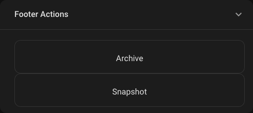
Footer with actions
Rendered preview
YAML
type: custom:universal-card
title: Media Console
body:
  cards:
    - type: media-control
      entity: media_player.living_room
footer:
  icon: mdi:remote-tv
  text: Secondary playback controls
  actions:
    - icon: mdi:skip-previous
      label: Prev
      action: call-service
      service: media_player.media_previous_track
      target:
        entity_id: media_player.living_room
    - icon: mdi:play-pause
      label: Play
      action: toggle
    - icon: mdi:skip-next
      label: Next
      action: call-service
      service: media_player.media_next_track
      target:
        entity_id: media_player.living_room
Footer slot cards
Use footer_left and footer_right when the footer needs utility controls or status indicators around the center content.
footer_left:
  cards:
    - type: button
      icon: mdi:volume-minus
footer_right:
  cards:
    - type: button
      icon: mdi:volume-plus
footer:
  text: Audio controls
When to use footer instead of header
Use footer for:
- lower-priority actions
- helper text
- playback or admin controls
- utility buttons that should not dominate the card
Keep the header for:
- primary identity
- main status
- badges
- the first action the user should notice
Styling
The footer supports all normal styling layers:
themetheme_tokensstate_stylescustom_css
If you need exact styling on footer internals, use:
scope: footer- hooks from Selector Catalog