Examples Gallery
Preview model. Visual examples use real Home Assistant screenshots and GIFs. Behavior-first examples use exact YAML when a static screenshot would not explain the feature well.
How To Use This Page
Use this page in two ways:
- jump to a use case and copy the closest recipe
- use YAML Block Reference when you already know which config block you need
If you want starter configs grouped by real dashboard scenarios, use Recipes by Use Case.
Focused guides for the main recipe families:
Recipe Index
| Use case | Best recipe |
|---|---|
| First card | Basic expandable card |
| Two-column summary | Grid layout |
| Mixed spans dashboard | Advanced grid with spans |
| Focused overlay | Modal with responsive sizing |
| Instant modal open | Modal with preload |
| Large media card | Fullscreen mode |
| Grouped content | Tabs mode |
| Slide-based navigation | Carousel mode |
| Route-based detail page | Subview mode |
| Header-only launcher | Header-only card |
| Header redesign | Header layout presets |
| Compact status row | Badge rules and icon-only mode |
| Footer actions | Footer cards and actions |
| Footer helper zones | Footer slot cards |
| Card shell actions | Root actions and context menu |
| Conditional UI | Visibility and section visibility |
| Badge-only visibility | Badge visibility on a separate entity |
| Swipe navigation | Swipe gestures |
| Combined gesture surface | Control surface with swipe and footer actions |
| Themed card | Themes, tokens, and state styles |
| Stable wall panel | Loading strategy and stable wall panel setup |
| Nested dashboard | Nested cards |
| Editor-first workflow | Editor-driven setup |
Layout Recipes
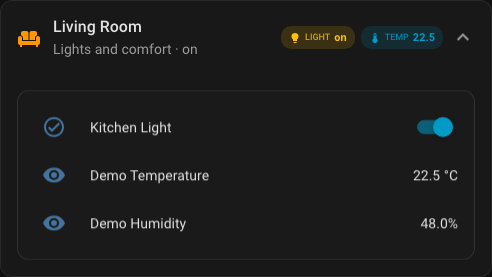
Recipe: Basic expandable card
Rendered preview
YAML
type: custom:universal-card
title: Living Room
subtitle: Lights and comfort
icon: mdi:sofa
entity: input_boolean.kitchen_light
theme: glass
badges:
  - type: state
    entity: input_boolean.kitchen_light
    icon: mdi:lightbulb
    label: Light
body:
  cards:
    - type: entities
      entities:
        - entity: input_boolean.kitchen_light
        - entity: sensor.demo_temperature
        - entity: sensor.demo_humidity
Recipe: Dense grid with explicit row and column gaps
type: custom:universal-card
title: Dense Summary
grid:
  columns: 3
  gap: 8px
  row_gap: 10px
  column_gap: 14px
body:
  cards:
    - type: button
      entity: input_boolean.kitchen_light
    - type: button
      entity: input_boolean.security_armed
    - type: button
      entity: script.evening_scene
    - type: entities
      colspan: 3
      entities:
        - entity: sensor.network_health_sensor
        - entity: sensor.house_mode_sensor
Recipe: Grid layout
Rendered preview
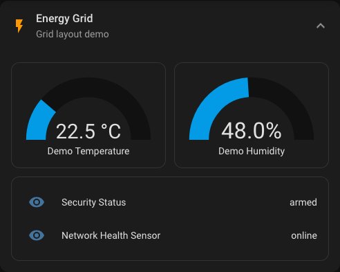
YAML
type: custom:universal-card
title: Energy Grid
icon: mdi:flash
grid:
  columns: 2
  gap: 12px
body:
  cards:
    - type: gauge
      entity: sensor.demo_temperature
    - type: gauge
      entity: sensor.demo_humidity
    - type: entities
      colspan: 2
      entities:
        - entity: sensor.security_status
        - entity: sensor.network_health_sensor
Recipe: Advanced grid with spans
Rendered preview
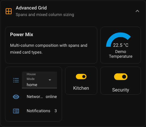
YAML
type: custom:universal-card
title: Advanced Grid
subtitle: Spans and mixed columns
icon: mdi:grid-large
theme: minimal
grid:
  columns: "1.4fr 0.8fr 1fr"
  gap: 10px
body:
  cards:
    - type: markdown
      colspan: 2
      content: |
        ### Power Mix
        Multi-column composition with spans.
    - type: gauge
      entity: sensor.demo_temperature
      max: 30
    - type: entities
      rowspan: 2
      entities:
        - entity: input_select.house_mode
        - entity: sensor.network_health_sensor
    - type: button
      entity: input_boolean.kitchen_light
      name: Kitchen
    - type: button
      entity: input_boolean.security_armed
      name: Security
Recipe: Modal with responsive sizing
Rendered preview
YAML
type: custom:universal-card
title: Security Controls
body_mode: modal
icon: mdi:shield-home
modal:
  width: auto
  max_width: 72rem
  max_height: 85vh
  loading_strategy: lazy
grid:
  columns: 2
  gap: 12px
body:
  cards:
    - type: entities
      entities:
        - entity: input_boolean.security_armed
        - entity: sensor.security_status
    - type: vertical-stack
      cards:
        - type: entities
          entities:
            - entity: sensor.demo_temperature
            - entity: sensor.demo_humidity
Recipe: Modal with preload
type: custom:universal-card
title: Frequently Used Controls
body_mode: modal
modal:
  width: auto
  max_width: 56rem
  loading_strategy: preload
body:
  cards:
    - type: button
      entity: input_boolean.kitchen_light
    - type: button
      entity: input_boolean.security_armed
    - type: button
      entity: script.evening_scene
Recipe: Fullscreen mode
Rendered preview
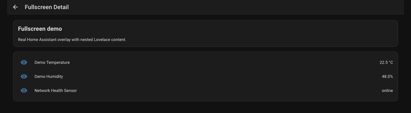
YAML
type: custom:universal-card
title: Camera Wall
body_mode: fullscreen
fullscreen:
  width: 92vw
  max_width: 96rem
  max_height: 94vh
  padding: 20px
body:
  cards:
    - type: picture-entity
      entity: camera.garden
Recipe: Tabs mode
Rendered preview
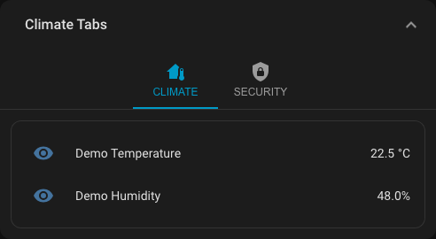
YAML
type: custom:universal-card
title: Climate Tabs
body_mode: tabs
tabs_config:
  content_padding: 12px
  tab_min_width: 96px
  tab_alignment: center
tabs:
  - label: Climate
    icon: mdi:home-thermometer
    cards:
      - type: entities
        entities:
          - entity: sensor.demo_temperature
          - entity: sensor.demo_humidity
  - label: Security
    icon: mdi:shield-lock
    cards:
      - type: entities
        entities:
          - entity: input_boolean.security_armed
          - entity: sensor.security_status
Recipe: Carousel mode
Rendered preview
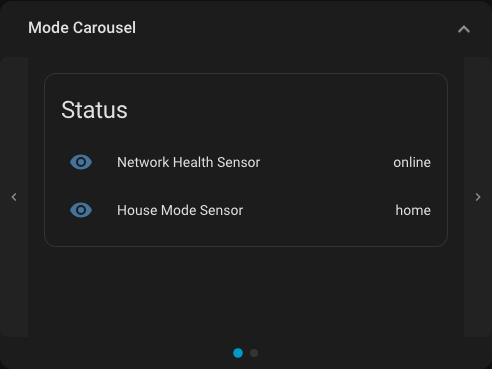
YAML
type: custom:universal-card
title: Daily Overview
body_mode: carousel
carousel_autoplay: true
carousel_interval: 4500
carousel_options:
  show_arrows: true
  show_indicators: true
  loop: true
  height: 20rem
body:
  cards:
    - type: entities
      title: Status
      entities:
        - entity: sensor.network_health_sensor
        - entity: sensor.house_mode_sensor
    - type: entities
      title: Comfort
      entities:
        - entity: sensor.demo_temperature
        - entity: sensor.demo_humidity
Recipe: Subview mode
Rendered preview
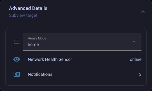
YAML
type: custom:universal-card
title: More Details
body_mode: subview
subview:
  navigation_path: /lovelace/details
  return_on_close: true
Recipe: Header-only card
Rendered preview
YAML
type: custom:universal-card
title: Quick Actions
subtitle: Header only
body_mode: none
badges:
  - type: state
    entity: input_boolean.kitchen_light
    icon: mdi:lightbulb
    icon_only: true
tap_action:
  action: navigate
  navigation_path: /lovelace/controls
Header And Status Recipes
Recipe: Header layout presets
Rendered preview
YAML
type: custom:universal-card
title: Kitchen
subtitle: Lights and scenes
header:
  layout:
    variant: stacked
    gap: 18px
    content_gap: 6px
    badges_position: below_content
badges:
  - type: state
    entity: input_boolean.kitchen_light
    label: Main
body:
  cards:
    - type: entities
      entities:
        - entity: input_boolean.kitchen_light
Recipe: Centered hero header
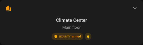
type: custom:universal-card
title: Climate
subtitle: Main floor
icon: mdi:home-thermometer
header:
  layout:
    variant: centered
    align: center
    badges_position: below_content
badges:
  - type: attribute
    entity: weather.home
    attribute: temperature
    icon: mdi:thermometer
    unit: °C
body:
  cards:
    - type: thermostat
      entity: climate.living_room
Recipe: Badge rules and icon-only mode
Rendered preview
YAML
type: custom:universal-card
title: Header Status
badges:
  - type: state
    entity: input_boolean.kitchen_light
    icon: mdi:lightbulb
    label: Main light
    color_rules:
      - operator: ==
        value: 'on'
        color: gold
      - operator: ==
        value: 'off'
        color: gray
  - type: state
    entity: vacuum.robot
    icon: mdi:robot-vacuum
    icon_only: true
    visibility:
      - operator: !=
        value: docked
    icon_tap_action:
      action: more-info
Recipe: Attribute badge cluster
type: custom:universal-card
title: Weather Summary
badges:
  - type: attribute
    entity: weather.home
    attribute: temperature
    icon: mdi:thermometer
    label: Temp
    unit: °C
  - type: attribute
    entity: weather.home
    attribute: humidity
    icon: mdi:water-percent
    label: Humidity
    unit: '%'
  - type: custom
    icon: mdi:weather-windy
    label: Wind
    value: 14
    unit: km/h
Recipe: Header slots with sticky state
type: custom:universal-card
title: Hallway
entity: sensor.demo_temperature
show_state: true
sticky_header: true
header_left:
  cards:
    - type: button
      icon: mdi:arrow-left
header_right:
  cards:
    - type: button
      icon: mdi:cog
body:
  cards:
    - type: entities
      entities:
        - entity: sensor.demo_temperature
        - entity: sensor.demo_humidity
Footer And Interaction Recipes
Recipe: Footer cards and actions
Rendered preview
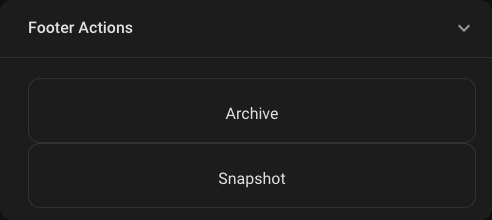
YAML
type: custom:universal-card
title: Security Summary
footer:
  text: Last check 2 min ago
  actions:
    - label: Arm
      icon: mdi:shield-lock
      action:
        action: call-service
        service: input_boolean.turn_on
        entity: input_boolean.security_armed
    - label: Cameras
      icon: mdi:cctv
      action:
        action: navigate
        navigation_path: /lovelace/cameras
body:
  cards:
    - type: entities
      entities:
        - entity: input_boolean.security_armed
        - entity: sensor.security_status
Recipe: Footer slot cards
type: custom:universal-card
title: Media Room
footer_left:
  cards:
    - type: button
      icon: mdi:skip-previous
footer_right:
  cards:
    - type: button
      icon: mdi:skip-next
footer:
  text: Media shortcuts
body:
  cards:
    - type: media-control
      entity: media_player.living_room
Recipe: Footer helper text with hold action
type: custom:universal-card
title: Network Summary
footer:
  icon: mdi:clock-outline
  text: Refreshed 2 min ago
  hold_action:
    action: more-info
body:
  cards:
    - type: entities
      entities:
        - entity: sensor.network_health_sensor
        - entity: counter.notifications
Recipe: Root actions and context menu
Rendered preview
YAML
type: custom:universal-card
title: Action Card
tap_action:
  action: navigate
  navigation_path: /lovelace/energy
hold_action:
  action: more-info
double_tap_action:
  action: toggle
context_menu:
  items:
    - label: Open details
      icon: mdi:open-in-new
      action:
        action: navigate
        navigation_path: /lovelace/details
    - separator: true
    - label: More info
      icon: mdi:information-outline
      action:
        action: more-info
body:
  cards:
    - type: markdown
      content: Tap, hold, double tap, or open the context menu.
Recipe: Badge visibility on a separate entity
type: custom:universal-card
title: Patio Status
badges:
  - type: custom
    icon: mdi:door
    label: Patio
    value: Open
    visibility:
      - entity: binary_sensor.patio_door
        operator: ==
        value: 'on'
body:
  cards:
    - type: entities
      entities:
        - entity: binary_sensor.patio_door
Recipe: Visibility and section visibility
Rendered preview
YAML
type: custom:universal-card
title: Admin Controls
visibility:
- condition: screen
min_width: 768
section_visibility:
footer:
- condition: user
is_admin: true
body:
cards:
- type: entities
entities:
- entity: input_boolean.security_armed
- entity: sensor.security_status
footer:
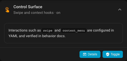
text: Admin-only footer actionsRecipe: Control surface with swipe and footer actions
Rendered preview

YAML
type: custom:universal-card
title: Control Surface
subtitle: Swipe and context hooks
icon: mdi:gesture-double-tap
entity: input_boolean.security_armed
context_menu:
  items:
    - label: Open details
      icon: mdi:open-in-app
      action:
        action: navigate
        navigation_path: /fixture-dashboard/details
    - type: separator
    - label: Toggle alarm
      icon: mdi:shield
      action:
        action: toggle
        entity: input_boolean.security_armed
swipe:
  enabled: true
  direction: both
  threshold: 48
  velocityThreshold: 0.2
  preventScroll: true
  left:
    action: next
  right:
    action: prev
footer:
  actions:
    - icon: mdi:open-in-app
      label: Details
      action: navigate
      navigation_path: /fixture-dashboard/details
    - icon: mdi:shield-check
      label: Toggle
      action: toggle
      entity: input_boolean.security_armed
body:
  cards:
    - type: markdown
      content: |
        Interactions such as `swipe` and `context_menu` are configured in YAML.
Recipe: Swipe gestures
Rendered preview
YAML
type: custom:universal-card
title: Gesture Card
body_mode: carousel
swipe:
  enabled: true
  direction: horizontal
  threshold: 60
  velocityThreshold: 0.35
  preventScroll: true
  left:
    action: next
  right:
    action: prev
body:
  cards:
    - type: entities
      entities:
        - entity: sensor.demo_temperature
    - type: entities
      entities:
        - entity: sensor.demo_humidity
Styling Recipes
Recipe: Themes, tokens, and state styles
Rendered preview
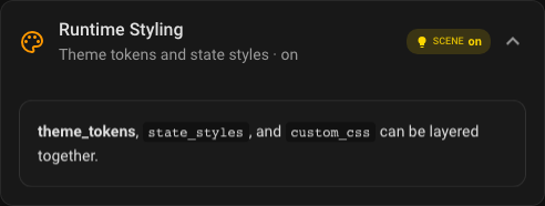
YAML
type: custom:universal-card
title: Styled Card
entity: input_boolean.kitchen_light
theme: midnight
icon_color: '#7cd6ff'
theme_tokens:
  --uc-background-color: "linear-gradient(145deg, rgba(9,16,27,.96), rgba(23,42,59,.92))"
  --uc-border-color: "rgba(117, 204, 255, 0.36)"
state_styles:
  'on':
    border_color: '#f4b400'
    box_shadow: "0 0 0 1px rgba(244,180,0,.36), 0 24px 52px rgba(244,180,0,.16)"
  'off':
    opacity: 0.72
custom_css:
  - scope: header
    css: |
      .header-title {
        letter-spacing: 0.05em;
        text-transform: uppercase;
      }
Recipe: Theme-only quick restyle
type: custom:universal-card
title: Midnight Summary
theme: midnight
body:
  cards:
    - type: entities
      entities:
        - entity: sensor.demo_temperature
        - entity: sensor.demo_humidity
Recipe: Custom CSS accent
type: custom:universal-card
title: Accent Card
theme: minimal
custom_css:
  - scope: card
    css: |
      .universal-card {
        border: 1px solid rgba(124, 214, 255, 0.28);
      }
  - scope: header
    css: |
      .header-title {
        letter-spacing: 0.08em;
      }
body:
  cards:
    - type: markdown
      content: Accent styling example
Performance And Editor Recipes
Recipe: Loading strategy and stable wall panel setup
Rendered preview
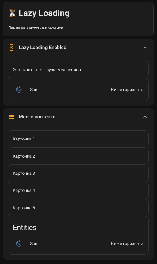
YAML
type: custom:universal-card
title: Stable wall panel
lazy_load: true
lazy_initial_batch: 1
lazy_batch_size: 1
lazy_idle_timeout: 180
stability_mode: true
remember_expanded_state: false
enable_card_pool: true
pool_scope: card
pool_max_entries: 8
body:
  cards:
    - type: entities
      entities:
        - entity: sensor.demo_temperature
        - entity: sensor.demo_humidity
        - entity: sensor.network_health_sensor
Recipe: Nested cards
Rendered preview
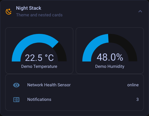
YAML
type: custom:universal-card
title: Operations Hub
grid:
  columns: 2
  gap: 12px
body:
  cards:
    - type: vertical-stack
      cards:
        - type: entities
          entities:
            - entity: sensor.demo_temperature
            - entity: sensor.demo_humidity
        - type: horizontal-stack
          cards:
            - type: button
              entity: input_boolean.kitchen_light
            - type: button
              entity: input_boolean.security_armed
    - type: entities
      entities:
        - entity: sensor.network_health_sensor
        - entity: counter.notifications
Recipe: Editor-driven setup
Rendered preview
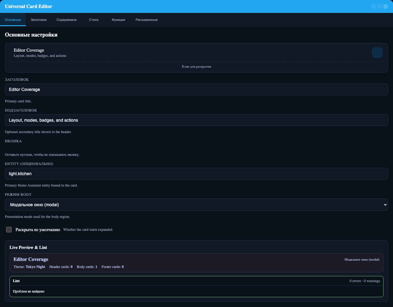
Recommended workflow
1. Set title, icon, entity, and body mode.
2. Add header layout and badges.
3. Configure tabs, carousel, fullscreen, modal, or subview settings.
4. Add visibility, swipe, and theme tokens.
5. Drop to YAML only for advanced CSS, action payloads, and complex grid strings.
Recipe: Badge-only status card
type: custom:universal-card
title: Services
body_mode: none
badges:
  - type: state
    entity: sensor.network_health_sensor
    label: Network
  - type: counter
    icon: mdi:bell
    entities:
      - binary_sensor.front_door
      - binary_sensor.back_door
    count_state: 'on'
    label: Alerts
Recipe: Compact dashboard launcher
type: custom:universal-card
title: Cameras
subtitle: Open security view
body_mode: none
icon: mdi:cctv
tap_action:
  action: navigate
  navigation_path: /lovelace/cameras
Recipe: Modal quick-control sheet
type: custom:universal-card
title: Evening Scene
body_mode: modal
modal:
  width: auto
  max_width: 48rem
body:
  cards:
    - type: button
      entity: script.evening_scene
    - type: button
      entity: input_boolean.kitchen_light
    - type: button
      entity: input_boolean.security_armed